“Balancing Act” – Artist Paul Yanko talks about the mural he and spouse Enid Williams created at Trenholm Plaza

by Mary Catherine Ballou

Photo courtesy of Paul Yanko

Over the summer, a mural emerged on one of the exterior walls of Trenholm Plaza, a shopping center located in the heart of Forest Acres.  Before its appearance, few examples of public art existed in this area.  Upon discovering this intriguing abstract rendering, Jasper intern Mary Catherine Ballou conducted with the mural’s artist, Paul Yanko.


Commissioned by EDENS (the longtime Trenholm Plaza property owners), Greenville-based artist Yanko painted the mural with help from his wife, artist Enid Williams. Yanko, an accomplished abstract painter and visual art teacher at the South Carolina Governor’s School for the Arts and Humanities (where he has been teaching for 13 years), completed the mural over the course of three months, working through the scorching heat from June through August to bring a lively and colorful display of public art to the community.


In the following interview, Yanko kindly provides information about his artistic history, how the mural developed, and his hopes for the mural’s impact on the community at-large.


Jasper: Please tell us about your artistic background.

Yanko: “I am originally from Northeast Ohio and I relocated to South Carolina in 2004 to teach full time at the South Carolina Governors School for the Arts and Humanities.  Prior to moving, I attended the Cleveland Institute of Art from 1986 to 1991.  I received a BFA in 1991 in Illustration, then I went back to graduate school to pursue an MFA in Painting, which I received in 1995.  Upon receiving my MFA, my wife, Enid Williams (Visual Arts Instructor at Greenville Technical College), and I occupied a studio in Ohio for eight years, so we really built our careers in Northeast Ohio, exhibiting regionally and nationally.  Then we moved to South Carolina…and have continued to exhibit regionally and nationally.”


Please describe your artistic process what inspired you to create this mural?

“That place [Trenholm Plaza] was designated by the property management company [EDENS], [but] the project was delayed slightly because of the flooding [in October 2015].  I made an initial visit to the site [during the summer of 2015], just to get a firsthand sense of the scale and overall surroundings.  That was [with] Mary Gilkerson from One Columbia and also a faculty member from Columbia College.  We made a time to meet up and I visited the Plaza in July of 2015 and got a sense of the actual dimensions and scale.  I was impressed with the renovations that had taken place in the Plaza.  I was struck by the combination of materials used – the wood combined with some of the tiling, and gridded meshed columns…with vines trailing up.  I was just kind of taking in everything that my first impressions were giving me, along with the fact that EDENS was looking for somebody [with] very broad, very open parameters…something very upbeat, lively.  I appreciated the fact that they weren’t requesting something so specific – it was open to 3D work as well – but for me as a painter, my response, my considerations for the proposal shifted to my area of expertise.


I started thinking about a palette – I recalled some site-specific works that I did in the early 2000s – 8-hour drawings at a college in Pennsylvania [and] 48 hours of making art [at] another college…[we were] given a weekend to camp in the gallery [and] assigned an area to create a work in 48 hours.  I collected an assortment of rollers, brushers, miscellaneous paints, ladders, and just rolled up my sleeves and got to work on it – 15 feet by 15 feet...You just have to plan and execute – it’s a very different way of organizing your time and activates compared to what you might typically do in the studio.


Those earlier projects provided a kind of frame of reference for this project.  I went back to using rollers in various sizes, lots of masking tape, a level, straight edges – pretty simple, straightforward tools.  It just became a matter of chalking off lines with Enid’s help – she was a big help on this project.  Once I did the layout, she or I would come back and tape and start rolling in those areas with an assortment of latex colors – gallon quantities of commercial latex paint – just to ensure there would be enough material for the size of the project, [and] organized a pallet of about nine colors.  I wanted the palette to correspond to impressions, sensations that I had taken in from the environment, also keeping in mind the location of the mural.  That particular context had a big drive in my palette.  [Then] I presented a proposal, artistic background, concept budget, and loose timetable for executing the work…


My current work in the studio – the process I employ of layering, masking, [and] building surface qualities guided my direction for the decisions for the proposal…kind of a combination of some previous installation projects.  Also, Enid and I executed a large mural in a public recreation center in the late 90s – we did that collaboratively so there were some past instances, but it also relates to my thought processes in the studio and on canvas.”


yanko 2

How different is it planning and painting an outdoor public mural compared to an in-studio piece?

“There’s certainly an awareness that’s timed in the studio [but] you do have to think about time differently [when working outside in a public space].  There’s a dry time [and] there are considerations about weather conditions.  I also teach full time, so the summer was really the only time to have this kind of continuity, opportunity to work – so summer just became the time to do or die.  My schedule is pretty…regimented anyway – it definitely has to be that way with the mural – [taking into consideration] traffic, do I have enough water, do I bring a lunch, do I have the right supplies because it’s not easy to stop.  It’s a little bit like comments I’ve heard from friends and family who do a little bit of backpacking [or] camping, in the way you have to organize yourself and get materials ready for the day, preplanning the night before.  Oftentimes our conversations for the day would be ‘We’re going to do the gray, blue, orange [colors today]…’”


How would you describe the experience of painting a mural in such a public forum? What’s the status of the mural now?

“It’s done – we made a big start in June – then we worked quite a bit through July on the project, and a little bit in August – just tried to consider the weather and timing.  It has been an exceptionally hot summer – no big surprises there.  We timed it for working a little bit earlier in the afternoon, so that was most productive for us.  We’ve been connected, been a part of the Columbia art scene for many years, [but] we decided to commute back and forth on the project.  I think having some time in-between the sessions of painting were helpful – just to think about other projects…in the studio [and] exhibitions to prepare for this summer.  It was a little bit of a juggling act.  That led me to titling the piece “Balancing Act”, which refers to time on the project, referring to what’s occurring in the mural itself – interaction of color and shape, how some of the elements seem to be leaning and precariously placed, buttressed by others, and (thirdly I would say) it makes a reference to the activity, the conversations that I was sort of exposed to, the clients, the patrons of the plaza.


When you’re working on a mural, you’re kind of on a rail like the track of an old electric typewriter – you’re going back and forth, up and down, back and forth, so you’re on this track while you’re working and this current of people [are] behind you in the Plaza.  It doesn’t stop – you overhear folks talking about their schedule for the day or picking up outfits – there’s this current in life moving on around you.  I think it might have been designated as a Pokémon hot spot – I saw a few younger kids face down following their phones stopping by the mural.  So there’s a little cultural thing going on – everyone will remember that was the summer that went on.  It’s very different working privately in the studio – a lot of questions were presented [and] the public couldn’t have been more supportive.  They had great questions, interest, enthusiasm for the project – they felt it was a favorable addition…”


yanko 3


How would you describe this mural? What feelings or emotions do you hope to convey through the mural?

“It’s abstract, a configuration of color, shape, using a simple vocabulary to build layer into something complex – it’s just taking in impressions and recreating those in a language of color and shape.  I used to title old paintings [for example] ‘Old Section, New Section’, [like the process of] building in a community – I sort of see this corresponding to my project.  I was really impressed to learn about what the Plaza meant to the community in the past – how this…is a real renovation template for EDENS, it seems to have gotten a revitalized interest and strong support from the community.  The general public was great – I got responses and remarks from small children to teens to adults…


I would like it to be engaging, through its complexity.  I would hope that people would be compelled to stop and allow their eye to find different points of entry – kind of navigate the network of lines, of stripes connecting messaging in the mural.  I would hope that it will provide something to serve as a point of discussion, to promote some dialogue, to elicit some kind of commentary – hopefully favorable in opinion – because viewing an actual painting [or] mural is not a passive thing – it’s not exactly like advertising along the highway.  I think it asks, hopefully, that the viewer return and notice something different and reconnect with it.  I’ve heard people comment about how it looks at night – I haven’t seen it at night yet – possibly at different times of the day, different weather conditions, different perceptions of it.  I prefer engagement and curiosity, and a reengagement.


I’d like it to kind of integrate itself in the community…and hopefully over time be regarded as a public sculpture or some other type of mural or artwork that already exists in Columbia.  The best outcome would be having it regarded favorably.  That’s a byproduct of working in the community…there’s people offering their opinions…you feel a connection with the community, you talk to people, get to know the staff of the Plaza, feel like a part of you is there.  This is a much larger audience, compared with a private collector [or] buyer.  I spoke to a broad range of [people]…you’re reminded of how diverse the community really is…”


yanko 5

Why do you think this public art is important for the community?

“It’s original, it forms a connection to the community in a very unique way that other projects might not – there’s a face to it, there’s a history, there’s a documentation of the process, there’s a record of the whole thing.  It’s not going to exist somewhere else in exactly [the] same incarnation…


It’s giving the community something unique.  It was created in the context of working in collaboration with a company like EDENS that is based in the community.  People can say that they saw the mural from the day that we started up to this point – so they feel a little bit of an investment.  Hopefully it will be a point of entry for someone interested in art – create a little interest that leads them going back to the Columbia Museum of Art [or] State Museum – showing them something that can exist outside of those institutions but still maybe have a connection.  I think that’s the value of what it can hold.


I think I would consider color [and] the consideration of shape very differently in another community.  As an abstract painter, I can say it has changed maybe gradually.  I think my work would have gone on a different trajectory had I not moved, but maybe not because you’re working out of your head and no matter where you live you still draw from that.  I didn’t want to artificially…embrace working in a different way just because I moved [from Ohio to South Carolina].  I think that maybe the conditions of lighting, the climate have made slow, more nuanced subtle changes in my work – that kind of thing influences how I go about collecting color.”


Do you have any future mural projects in-store that you want to tell Jasper readers about?

“I’m working on a project…in collaboration with Lululemon athletic attire.  I was approached about a year ago from them to develop work in partnership with their designer for a store opening in Greenville.  It’s going to be a very different type of appearance and approach altogether.”


Any closing remarks?

“A nice feature about this project [at Trenholm Plaza] – I developed the concept [and] my wife and I executed the work.  That creates a different level of investment…I’m not acting as a hired hand to execute the work from start to finish. My role has been from planning, to execution, to purchasing the materials.  I don’t have a [business] card and I don’t paint murals all the time – I think it would be a very different type of mural if a fulltime muralist had been contracted.  My work is not coming out of other mural projects as much as it does out of things in the studio – [and] informed by some of those earlier projects.  I do think it’d be a very different project if it were executed by a full-time mural team.


I’m really grateful to have been selected – it was a really productive experience.  At the end of the day, I just want the community to feel a kind of connection to the work – part of that can be felt [by the fact that] we were just painting out in the open.  People can see what was going on, [it] give[s] everybody a chance to acclimate to the changes over time – [I] enjoyed that approach instead of a big unveiling at the end.”


yanko 6


A dedication ceremony for the mural will take place on September 21st at 10:30AM in Trenholm Plaza. For more information about the artist, please visit http://www.paulyanko.org/.


Answering the Call: American Victory Posters from the First World War - exhibit at SC Confederate Relic Room & Military Museum

by Mary Catherine Ballou


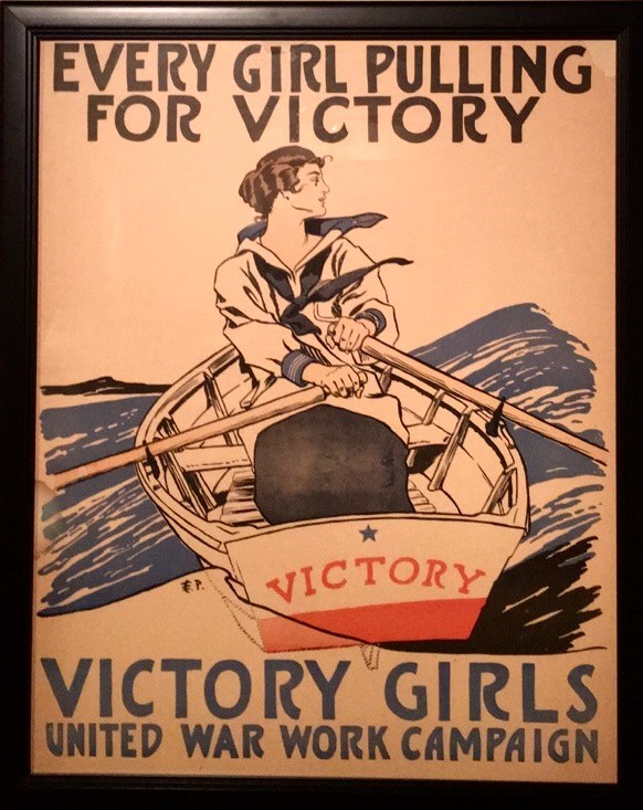
Photo: Every Girl Pulling for Victory, Edward Penfield (American, 1866-1925), 1918, Chromolithograph


Answering the Call: American Victory Posters from the First World War, currently on display at the South Carolina Confederate Relic Room and Military Museum (located in the Cistern Gallery at 301 Gervais Street inside the SC State Museum building), proves that fascinating art shows can sometimes be found in unlikely places.  Consisting of 38 chromolithograph posters advertising Liberty Bonds and other wartime fundraising efforts, along with various WWI memorabilia including uniforms, helmets, and artillery shells, this exhibit grants viewers a gander at century-old artifacts that served crucial roles during a stark turning point in history, when the United States went from honoring a staunch isolationist policy to becoming involved in a global, casualty-ridden war.


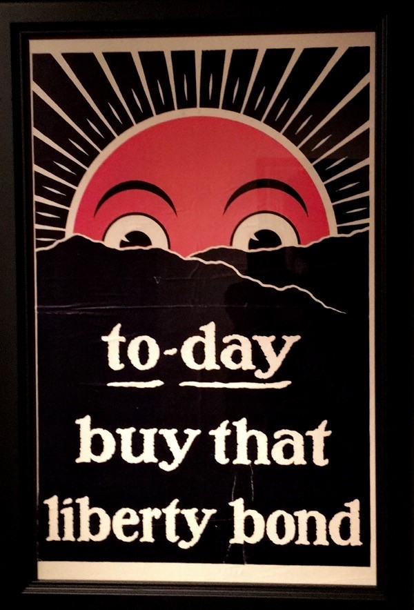
Photo: To-Day Buy That Liberty Bond, Anonymous, 1918, Chromolithograph


The artistic elements of this exhibit loom just as intriguing as the historical aspects.  Each poster is a chromolithograph, which means they are colored prints.  The word ‘chromolithograph’ derives from the Greek words for color, stone, and writing – ‘khroma’, ‘lithos’, and ‘graphe.’  The importance of the visual techniques used in these posters remains evident throughout the collection.  While each was mass-produced to serve as propaganda to citizens during WWI, the graphic design components of the posters reflect an equally important purpose – to act as durable, attention-grabbing, clearly understandable forms of visual media.

Photo: V (for Victory), Anonymous, 1919, Chromolithograph


One of the informational displays in the gallery states, “Maybe it is not so difficult to imagine the impact that commercial art had on the lives of the American people during World War I in light of the astonishing and sometimes overwhelming influence of visual media on today’s culture.  Social media sites, cell phone applications, television, now all interconnected and omnipresent, infiltrate our social landscapes in ways that posters once could not, but the messages and images they carried succeeded in doing.”  During the pre-television, pre-Internet time of the 20th century, printed graphics, along with newspapers and radio, served as vital forms of media.  As a result, these ubiquitous posters were constant, visual reminders to Americans across the country during WWI.


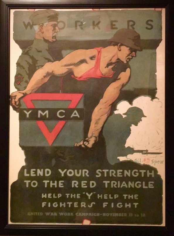
Photo: Lend Your Strength to the Red Triangle, Gil Spear (American, active in 20th century), Chromolithograph  

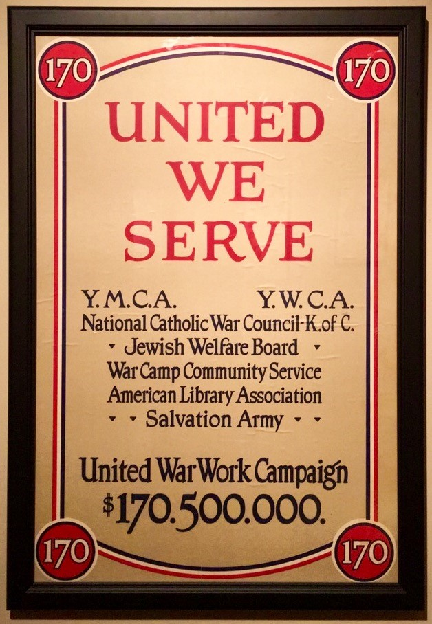
An array of demographics and organizations are displayed in these posters, including but not limited to: The Red Cross, Knights of Columbus, the Boy Scouts, YMCA and YWCA, and women.  Representations of African Americans during WWI appear in two illustrations in the exhibit, one of which reveals a black, uniform-clad American soldier that is entitled “The heads of the German Kaiser and Emperor of Austria-Hungary pinned by his arms.”  The uniform of a female Red Cross volunteer in France and Germany from 1917-1919 stands next to these illustrations, entitled “Red Cross Uniform Worn by Anna Heyward Taylor.”  Another noteworthy piece on display includes a Norman Rockwell chromolithograph entitled “Is He Getting It Over?” (1917-1918).  The print shows a young American soldier attempting to speak French, serving as an advertisement for a YMCA-sponsored French language instruction book.  The classic “I Want You for U.S. Army” (1917) print by James Montgomery Flagg, which portrays Uncle Sam sternly pointing his finger at the viewer, hangs in the gallery as well.  The placard next to this piece affirms its enduring popularity, stating, “Between 1917 and 1918, over four million copies of this poster were printed.  The image was so popular that it was put to use again to stir the masses into action during World War II although it remains familiar even to modern audiences.”


Photo: Conflit Européen (The heads of the German Kaiser and Emperor of Austria-Hungary pinned by his arms), 1914, Poster


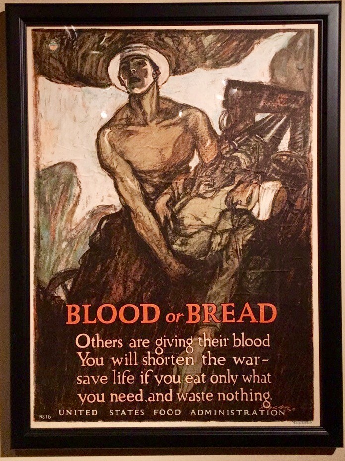
Answering the Call: American Victory Posters from the First World War reinforces the historic significance and success of these posters.  It also provides an intimate survey of these artistically rich artifacts that are rarely seen in-person today, but remain quite recognizable nonetheless.  The power of visual art to inspire, motivate, and instill certain values in viewers is self-evident in the results of these posters, whose sole purposes were to persuade Americans to finance the United States war effort through the purchase of liberty bonds and stamps.  According to the exhibition, “Upon the Allied victory on November 11, 1918, less than two years after the United States declared war, the five combined loan drives raised over 20.5 billion dollars, enough to cover 100% of American military expenses.”  This is a classic example of what stirring propaganda can do to motivate people to achieve a common goal.  Filled with bold, vivid colors and impassioned compositions, the posters in this exhibit capture the essence of modernistic mediums and artistic trends such as art nouveau.  Many of the illustrators of these pieces appear to be inspired by both impressionistic and realist art forms, with a combination of bright and light colors, linear shading, and dramatic expressions and scenes.  The powerful images reflected in these posters promote an emotional response even today, as they were originally intended to do during WWI, and they serve as a testament to both the skill and expertise of the talented artists of this era.


Photo: Blood or Bread, Henry Patrick Raleigh (American, 1880-1944), 1917, Chromolithograph  

A travelling exhibit from Hollingsworth Fine Arts, Answering the Call: American Victory Posters from the First World War will be on display at the SC Confederate Relic Room and Military Museum through December 30, 2016. For more information, please visit: https://www.crr.sc.gov and http://www.hollingsworthfinearts.com/#!answering-the-call/cg3.


Photo: United We Serve, Anonymous, 1918, Chromolithograph

REVIEW: The Get Down - a new Netflix Original series -- By Mary Catherine Ballou

  get1

As fads become fixtures, nouns describing these trends sometimes have a tendency to be used as verbs in colloquial speech.  Once this transformation occurs, the saying has the potential to become overused, turning it cliché at best and reprehensible at worst.  Such is the case with the ubiquitous remark, to “Netflix and chill”.  While this phrase evolved to connote sexual undertones, it grows difficult to deny the popularity of this slang verb usage – Netflix proves time and time again, ahem, regardless of ulterior motives on the part of viewers, that this streaming service is efficient and entertaining, allowing audiences to access scores of television shows and movies culled together in one convenient location.


With that being said, the new Netflix original series entitled The Get Down (released August 12) is well worth watching, especially if one is partial to musically charged period pieces.  Created by Baz Luhrmann and Stephen Adly Guirgis, with production assistance from music industry professionals including Grandmaster Flash and Nas, The Get Down emphasizes quality over quantity – there are currently only six episodes available to watch on Netflix, the budget of the show is anything but cheap, and the pilot itself runs for over an hour and a half.  Luhrmann, known for his cinematographic stylization in such films as Romeo + Juliet (1996), Moulin Rouge! (2001), and The Great Gatsby (2013), directs The Get Down in a similarly stylized mode appropriate for the setting of the show.  A gritty, lavish, and aesthetically striking escapade, the storyline revolves around a group of talented teenagers growing up in the Bronx during the birth of the hip-hop scene in 1970s New York.  Concurrently, the show focuses on the rise of disc jockeys out of the disco era, buffeted to popularity with the innovation of spinning two records at once in order to mix and play multiple beats in a continuous loop.

get2


Starring an exceptional cast, the characters are gifted with an assortment of skills.  The role of Ezekiel (Justice Smith), nicknamed “Books” for his knack with poetry and eloquent way of speaking, is considered the “Word Master” of the group as he recites lyrical rhymes that morph into song.  Shaolin Fantastic (Shameik Moore) serves as the “Grasshopper” hustler inclined to martial arts, who soars through scenes like a feather-footed conqueror of the night.  There is no shortage of strong female roles, either.  Breakout actress Herizen Guardiola plays Mylene, the female protagonist graced with a beautiful voice and steadfast disposition who must confront her family’s expectations and her own aspirations to achieve her dream of a career in musical performance.


The Get Down exudes an ethereal, almost ornate air reminiscent of theatrical elements used in productions such as the film adaptation of West Side Story (1961), in which visual and musical artistry stands side by side with hatred and violence.  Bold and colorful costumes and sets; interwoven stanzas of song, dance, and rhymes; and gripping storylines infuse The Get Down with vibrancy that helps to anchor this captivating drama.  The camera zooms sporadically in and out of eccentric details, cutting back and forth in a swishing manner while myriad disco and hip hop tunes provide auditory stimulation, conjuring an atmosphere of surrealism on screen.  The Get Down contains Shakespearean overtones, revealed in the occasional formality of language and the assortment of characters and plots depicted – some appear wise beyond their years while others act foolish and shortsighted.  Various aspects of the show also recall the storylines of such classics including Oliver Twist and Peter Pan, with groups of delinquent youth running around dilapidated city streets and burning buildings in the struggle to survive on a daily basis.

get3


This series incorporates components of the artistic fields – dance, music, poetry, theatre, and fashion each play simultaneously major roles.  These creative details, combined with poignant storylines and struggles, render the show compelling.  Graphic and uncompromising at times, The Get Down streams like a fantastical whirlwind tour of the not-so-pretty sides of the crime-ridden and impoverished streets and hangouts of the Bronx in the 70s, coupled with soulful and candid vignettes of the characters’ lives.


Piquant and provocative, The Get Down places a spotlight on the crucial role of the citizens of the Bronx in New York City in the 1970s, during a time of turmoil and revolution both musically and socially.  Alternating scenes of heartbreak and victory distinguish this show, portraying both the doldrums of teenage life and the treacherous adventures these youth decide to embark on in an attempt to fulfill their potentials and utilize their talents, all with the hopes of breaking free and soaring as confident leaders in the world.


Film Review: Captain Fantastic By Mary Catherine Ballou

captain fantastic Starring Viggo Mortensen, well known for his role as Aragorn in the Lord of the Rings trilogy, and a talented group of emerging young actors and actresses, Captain Fantastic presents viewers with the story of an eccentric father named Ben (Mortensen) who raises his six children in a remote forest of the Pacific Northwest. Ben assumes the role of stay-at-home-dad as a result of his wife’s hospitalization due to a debilitating mental illness. Captain Fantastic divulges the tale of this irreverent outdoorsman and his strong-willed children, who undertake the noble quest to honor their mother and fight for their freedom to live as they choose.


Written and directed by Matt Ross, Captain Fantastic takes viewers on a visual and emotional journey, from the magical dew-drenched greenery of the Pacific Northwest, through the highways and byways of strip-mall America, to mansion-filled suburbs of New Mexico. Interspersed throughout are scenes of sparsely populated RV parks and the family’s insider-versus-outsider struggle against mainstream society. The chosen mode of transportation for their “mission,” as the children call it, is a renovated school bus retrofitted to accommodate Ben and his six children.


In the opening scene, the camera zooms over panoramic mountainside views, immediately enveloping viewers with the raw, natural beauty of the land that Ben and his children call home.  As the film portrays their household routines, bringing to mind memories of playing outside as a kid, and intense training sessions, designed to maintain peak physical and mental conditions, viewers become accustomed to the core facets of this family – an idealized, yet isolated, existence governed by the attainment of mental and physical prowess. Ben and his wife, Leslie, decided early on to raise their children in this natural environment infused with Buddhist traditions, sheltered from capitalistic culture.


Throughout Captain Fantastic, three aspects emerge as dominating themes in this film – the aesthetics of the environment, the importance of family and camaraderie, and the transformation of characters as a result of their struggles. Ben and his children have nearly become one with nature, growing vegetables, raising chickens, hunting animals for food, hiking and climbing rigorous terrains, and sleeping under the stars. They have no need for electronic distractions – books, musical instruments, and intellectual dialogue comprise their evening routines. Mimicking their strong physical conditions, the children’s book smarts and eloquence surpass their young ages, as they undergo exacting tests under the watchful eyes of their father.


The family nucleus plays a dominant role in this film, as Ben’s family embraces the notion of strength in numbers. Ben and Leslie taught their children to appreciate nature and the importance of physical and mental strength, embodied in their capacity to survive in the wild. However, within this family, challenges abound.


In addition to the strenuous training sessions that Ben’s children endure, they must also deal with the encroaching challenges of the outside world. Ben attempts to remain immune to mainstream society, strengthened by his mental and physical acuity he submits his children to rigorous, at times shocking, physical challenges. Yet, the greatest challenge he and his children ultimately face is the one posed by his wife’s health issues. Consequently, his family must leave their paradise in the woods and confront society in ways they never imagined. By fighting to preserve his beliefs, Ben’s family structure nearly collapses and he risks losing his children in the process. Still, a transformation occurs in each of the characters. In no way are they static; rather, the family undergoes dynamic changes, but their love and respect for each other is a mainstay of the film.


Captain Fantastic reveals the paradox between the life of Ben’s family and that of mainstream American culture, one that is dominated by modern technological amenities. By demonstrating these two disparate ways of living, the film reminds viewers that one does not have to accept societal norms. Even so, Ben faces no shortage of backlash and difficulty as a result of the stark difference between his beliefs and those of his wife’s family in New Mexico. At certain points, Ben does some things that may cause viewers to question his sanity, and everyone from his father-in-law to his own sons challenge his beliefs and lifestyle choices.


A beautiful and highly recommended film that sends a profound message about what type of path one chooses to tread in life, Captain Fantastic rattles established frames of mind and challenges viewers to contemplate the world in a new light, provoking and inspiring an appreciation for nature and the simple things in life.


Susan Felleman and Kristin Morris Talk with Jasper about the Bechdel Test & Women in Film by Mary Catherine Ballou

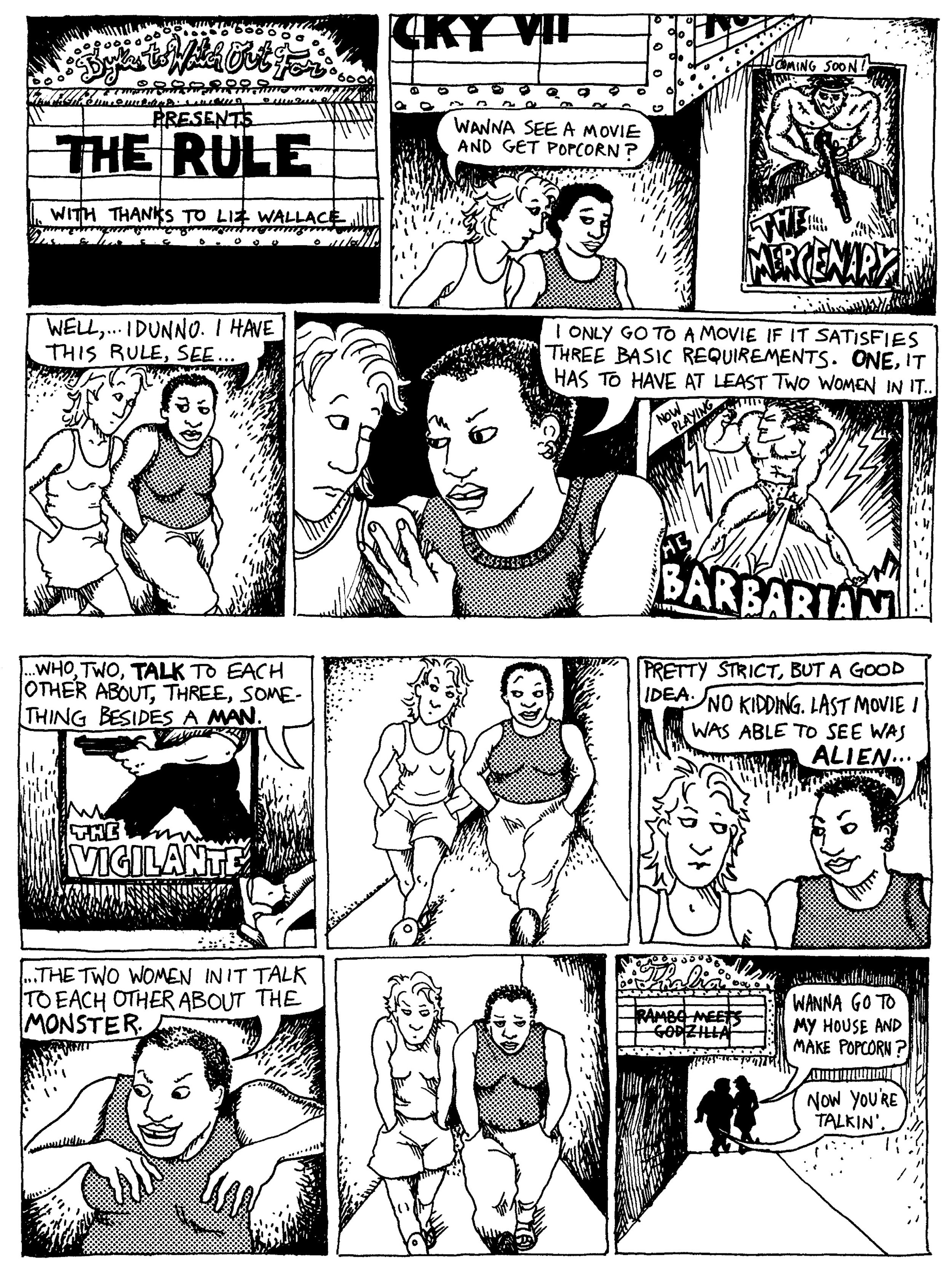
Bechdel test The Bechdel-Wallace Test, also known as the Bechdel Test, emerged out of the 1985 comic strip by Alison Bechdel entitled “The Rule.” In order for a film to pass the Bechdel test, it must satisfy three rules:

  1. There must be two female characters
  2. Who have a conversation with each other
  3. About something other than a man

At first glance, these may seem like simple stipulations for a film to meet. Yet, many films surprisingly do not pass this test. According to a study completed by Walter Hickey of FiveThirtyEight.com, “In a larger sample of 1,794 movies released from 1970 to 2013, we found that only half had at least one scene in which women talked to each other about something other than a man.” In light of this statistic, it remains imperative to realize that the Bechdel Test does not provide a definitive measure of a film’s overall worth. For instance, some films do not pass the test but they still portray strong female characters. For example, the movies that comprise The Lord of The Rings trilogy do not pass the Bechdel Test; however, each of the films showcase powerful female characters such as the elves Galadriel and Arwen, played by Cate Blanchett and Liv Tyler, respectively. On the other hand, some films that might be interpreted as vapid or sexist, such as this summer’s Mike and Dave Need Wedding Dates (released July 8, 2016), manage to pass the Bechdel Test.


Despite these variables concerning which films pass, the Bechdel Test still reveals an inherent bias against women in film. While the Bechdel Test is certainly not a conclusive source for judging film quality, it reinforces deeper implications like the ingrained prejudice against women in our culture and the sexist stigma prevalent in the film industry today. While it may not provide a comprehensive measurement of film quality, the test still provides insight into the bias displayed against females on screen. Moreover, it sheds light on subliminal messages frequently espoused by the media that relegate women to demeaning roles. We must acknowledge these subconscious messages that perpetuate cultural and sexist stereotypes.


As with any struggle, there are ups and downs in the progress towards gender equality on screen. Nonetheless, female actors seem to be making strides, as demonstrated by some recent summer releases that feature female leads and pass the Bechdel Test. Such films include The Shallows and Ghostbusters. Starring Blake Lively, The Shallows (released June 24, 2016) tells the story of a woman attacked by a shark who must fight for her life while stranded on a rocky outcrop. The Shallows contains more depth than one may initially expect before viewing – Blake Lively’s character acts as an instrument of her own fate, and she succeeds in an impressive way. Even though a male figure appears at the end of the film, he does not act as her savior – she survives due to her own actions, instincts, and will to live. Moreover, the female-dominated cast of the new Ghostbusters (released July 15, 2016) demonstrates a step in a more gender-equal direction within the realm of blockbuster films.


Even so, it remains difficult to gauge the full extent and future of women’s progress on screen, due to the perpetuation of male-centric films, and because the Bechdel Test does not provide a complete measure of a film’s inherent feminism. If nothing else, the test serves as an intriguing surface-level assessment that evaluates on-screen gender disparities and the roles portrayed by women in our male-dominated culture. Clearly, it suggests a rampant and inherent misogyny bred within the movie industry. Of course, many differences between the sexes are to be celebrated; yet, misogyny remains something that females must contend with in both private and public spheres, on and off the screen.


With these thoughts in mind, two local Columbia professionals, Susan Felleman and Kristin Morris, kindly agreed to be interviewed and share their thoughts regarding the Bechdel Test and the state of feminism in film today. Each of their answers provides insight into this culturally and historically relevant topic that cannot be ignored. Their interviews appear below:

 ~~~~~

Susan Felleman is Professor of Art History in the School of Art and Design at the University of South Carolina


Jasper: How did you first learn about the Bechdel-Wallace test?

Felleman:  I am not really sure when I first heard of what was then referred to as the Bechdel test, probably in the late 2000s and possibly from Anita Sarkeesian’s “Feminist Frequency” blog and video series. https://www.youtube.com/watch?v=bLF6sAAMb4s


What was your initial reaction to the Test Requirements?

I guess I found it a useful tool, less for judging films than for getting students to see and think about the sexist conventions of movie stories. At the time I was teaching in a film program.


Do you find any downsides or shortcomings to the Bechdel-Wallace Test?

Of course, if it’s applied programmatically, which it shouldn’t be, as its origins are to be found in a couple frames of a comic strip. As Anita Sarkeesian notes, passing the test doesn’t make a film feminist, or even good. Conversely, it’s possible for a good film to fail the test, even a feminist one! For instance, I noticed that one of my favorite films, one I often teach, Sally Potter’s vanguard and gender-bending film Orlando (1992)—written and directed by a feminist filmmaker; and adapted from a feminist novel by Virginia Woolf—cannot pass the test.


Do you think the Test provides a helpful analysis of female roles in films?

No, not really. It’s more descriptive than analytical.


What are your general thoughts regarding the current state of feminism/female roles in films today?

Oy! Sometimes it seems that the more things change, the more they stay the same. As with filmmakers of color, women have made very slow inroads into mainstream film production as writers, producers, cinematographers, or directors. And, as with people of color and other minorities, the representation of women in commercial film tends to suffer from grievous bias, as well as tokenism. Women are still by and large treated as objects by an exceedingly conventional popular cinema, even in the occasional film in which they are permitted agency.


Things are a little better in independent and some global cinema, and considerably better in documentary filmmaking. And this new golden age of television has been remarkable for women, on both sides of the camera, although television, too, remains male dominated. I’ve noticed for a couple decades now that many women directors who’d had one or two breakthrough independent films but had fallen from view in Hollywood were increasingly turning up in TV credits. The fragmentation of the audience in the current TV environment has allowed for such noteworthy developments as the success of Shonda Rhimes and Netflix’s original shows like Orange is the New Black, Master of None, and Unbreakable Kimmy Schmidt (three series I enjoy!). That said, one mustn’t forget the added prestige and capital invested in shows with a more typical institutional imprimatur, like The Wire, The Sopranos, Breaking Bad, Mad Men, etc.


 ~~~~~

Kristin Morris is Marketing Manager at The Nickelodeon and President of the Board of Directors for Girls Rock Columbia


Jasper: How did you first learn about the Bechdel-Wallace test?

Morris: I can't remember the exact moment I first heard of the test, but I'd guess about 7 or 8 years ago? I've only ever heard it referenced as the 'Bechdel Test.'

What was your initial reaction to the Test Requirements?

Initially I think everyone jumps right into seeing if any of your favorite films meet the criteria - and quickly realizing that so many big commercial films don't.

Do you find any downsides or shortcomings to the Bechdel-Wallace Test? 

I think it’s a first step, but there are films I wouldn't necessarily consider 'pro-woman' that would meet the criteria. I remember reading an article how the film Sucker Punch passed the Bechdel Test, even though its arguably adolescent boy fantasy that objectifies young women. I also think that feminist thought has developed beyond the simplicity of the Bechdel test. Race, culture, gender identity, nor sexual orientation are addressed, which are all big parts of the feminist conversation we're having now.


I read a few years ago that Alison Bechdel actually came up with the criteria as a joke in a comic she wrote -- so I don't think it's initial intention was to be taken as a standard for feminist films. It was framed as the most baseline measurement that could still rarely be met. That's so sad you have to laugh at it, I guess?!

Do you think the Test provides a helpful analysis of female roles in films? 

Not really. If you go through the list of films that pass the test I don't think you'd see them having strong female characters with interesting and complex relationships. For example, here are some of the films that have been released this year that pass the test: Batman vs. Superman, The Purge: Election Year, Captain America: Civil War, and Warcraft. While these big budget movies technically meet the Bechdel criteria, none of these are primarily representing women.


What are your general thoughts regarding the current state of feminism/female roles in films today? I think the focus on women in film is expanding from acting to include directing, writing, producing, and crews. If you're ignoring all of the creative process before there's an actress on a movie screen, you're missing 90% of the process. Outside of the film world, we're looking at representation and who's making decisions. Governments and corporations are intentionally bringing more women on as cabinet members, executives and board members.

In 2015, women accounted for 9% of directors, up 2 percentage points from 2014 but even with the figure from 1998. In other roles, women comprised 11% of writers, 26% of producers, 20% of executive producers, 22% of editors, and 6% of cinematographers (http://womenintvfilm.sdsu.edu/research/). If we had more women at the writing table and behind the cameras there wouldn't be a need for tests like the Bechdel Test - maybe?


A lot of the work we do at the Nick is featuring filmmakers from marginalized groups. I'm working on a festival in November celebrating the 25th anniversary of the film Daughters of the Dust, which was the first film made by a woman of color to receive national distribution. We've invited 8 emerging female filmmakers of color to come to Columbia and exhibit their work and have conversations about their experiences as young women of color in the film industry. There's more info about the project here: http://nickelodeon.org/festivals/daughters/


 --Mary Catherine Ballou is an intern writing for Jasper Magazine.

INTERVIEW: Edward Schmunes, Photographer by Mary Catherine Ballou

Schmunes

Local artist Edward Shmunes incorporates photography and mixed media to create two-dimensional art.  Shmunes has been photographing for twenty-six years and counting, with pieces in shows, collections, and galleries across the country.  In the following interview, Shmunes kindly discusses his artistic background, inspirations, and process, revealing the importance of passion and instinct in his artwork.


Jasper: How did your interest in photography develop?

Shmunes: “I’ve been coloring since I was three, so I’ve always done that, I colored instead of [making] model airplanes.  I had limited interest in most things like Erector sets, similar to Legos, the Legos of my years – I really didn’t like that stuff.  I always wanted to color, color, color.  I never had an expensive camera until I became a dermatologist.  My partner and I decided to buy one for our practice…a 35 mm camera for the first time in my life.


I went to Charleston in the 70s and took some pictures.  I was a good friend with the Chair of the Department of Photography at USC, he saw them and said they were good and that I ought to do something with that.  I put something in the State Fair and won top prize in the amateur section, then I started putting stuff in galleries because it seemed to work.  At that time they had some art fairs downtown [in Columbia] before Vista Lights [existed] – things in the spring like a May festival. I remember I had a booth set up on the museum grounds, and the director came and bought a piece for the museum – that made me feel really good. I started entering shows…I’ve entered hundreds of national art shows [and] I got these affirmations that the stuff was good.”


Jasper: Have your artistic interests always been confined to photography, or have you explored other mediums?

Shmunes: “I’ve never had any training, just a natural eye for what’s good and what’s bad.  I painted a little bit in medical school…[but] photography is instantaneously satisfying.  I do better with a jumpstart, so even if I may take a picture and run with it and change it, that jumpstart is helpful for me, as opposed to a blank canvas.  [I] use photography as a quick springboard to start with an image…because my work is described as somewhat surreal, it does involve manipulation.  Early on [in the pre-digital age], I used to add dyes to glossy photographs (when glossy photos are printed they are in a water system…these are water soluble dyes, you can put them on a shiny surface and [they] dissolve into the surface so it doesn’t leave a mark but you can add colors).  Part of my approach to art in general is to have something that is engaging and fresh, hooks the viewer…[it] might not be on a conscious level at first.”


Jasper: What role does digital photography now play in your artistic process?

Shmunes: “I have a friend named Dixie Allen, [she] used to teach computer graphics at USC, layout the Riverbanks Zoo Magazine, [and currently] makes Clipart on a national level.  She helped me learn Photoshop, for which I’m immensely grateful.  She gave me the basics…I’m no Photoshop whiz, but I have enough knowledge.  It’s just another paintbrush…as with all tools you can manipulate things differently.  I’m careful not to have something look [too manipulated]…if it screams manipulation before you can even see it, that’s a blockade to the viewer’s enjoyment.  You have to know what works.


I go on lots of trips, I look at every picture [I take] in Photoshop because it can be blurry as can be, and I might say, ‘Wow look at this blur!’  Or I wasn’t even aware that [something] wasn’t even over there...[so I] crop it and store it to be used for another photograph – it’s very time consuming.”


Jasper: Where does your artistic inspiration come from?

Shmunes: “It comes from the things that shout ‘take me!’  I like to be in a fresh, new area because your mind is open to new [things]…there are so many things that shout ‘take me!’ and so I listen to it and take it, because to me, they’re yelling! Sometimes you get it. [Other times] you’ll see the picture and wonder why it said ‘take me!’ and sometimes you’ll see in the middle is where something was screaming…you usually can find it when you look at the picture. It’s pretty true, follow your instincts…I do get rid of a lot of stuff, there’s so much that’s distracting in a picture, whether it’s a line leading you out or a chandelier that looks like it’s growing out of a person’s head.”


Jasper: Are there any parallels between your artistic and professional career?

Shmunes: “Dermatology is visual.  I went into something that I could see – you recognize clinical presentations by the nuances of their color, also feel – but visuals are hugely important.  That’s why they have Teledermatology - that whole field of having rural access to specialists via television cameras is very important for rural [practices].”


Jasper: If you could give some advice to aspiring photographers, what would it be?

Shmunes: “My advice would be to not let people tell you what to do, because they’re going to tell you the conventional things to do.  When work stands out, it’s usually not conventional, so if you want to be a conventional artist, go take a lot of courses.  I’ve never had any courses, I resist it…


I love looking at other people’s stuff, taking it in, I get very vitalized and enervated by looking at other people’s work and listening to them – [but] that’s different from going to a photography course.  I’m not a nature photographer.  If I was, then I’d see why I’d want to take courses from a master nature photographer.  Or if you’re doing darkroom work then you need to learn technique like that…I’m not doing stuff like that.


Just when you look at other people’s works and go to museums and shows, that is a lesson, or you hear somebody talk about their work - those are what I love doing, as opposed to taking a workshop.  Now, I might benefit from a technical, Photoshop workshop…


Photography has been a stepchild of art for a long time.  Particularly in the South…photography is new on the scene.  A lot of big cities have art shows and they are multimedia [as opposed to just photography shows]. In terms of advice to people, the materials you use really do matter.  Starting out, you are limited in your budget…it can really detract from a piece to have a [cheap] frame.  If you really love your piece, then use good materials to show off your piece.”

 ♦ ♦ ♦ ♦ ♦ ♦ ♦ ♦

Shmunes is fortunate to have exhibits at galleries such as City Art in Columbia.  He states, “I’m very proud of City Art – the caliber of the people, they have not turned it into a gift shop.  They have the building space to rent out and the art supply store downstairs.  It’s a very hard business, selling art…but they’re going to keep it mainly a gallery, they have high standards.  And the gallery I’m in in Charleston is an interior design place (Mitchell Hill Interiors) that’s very high-end.”


Shmunes is currently working on photos he took in Australia of various subjects, ranging from animals to Aborigines.  However, Shmunes explains: “I’m not a nature photographer, I don’t normally photograph animals…[also] I love to write and have tangential commentary that hopefully compliments the piece, [and] adds to the humor or mystery.  I gravitate basically to things that are surreal…they are going to be edgy and sometimes quirky.  That’s normally what I like because it’s fresh and different, so I try to put that into a landscape if I can do something that makes it special.”


For more information and to view portfolio images, please visit edward-shmunes.pixels.co

BOOK REVIEW: Patti Smith's M Train by Mary Catherine Ballou

  (Photo: M Train, Smith 133)


“I stood in front of the fence on tiptoe and peered through the broken slat.  All kinds of indistinct memories collided.  Vacant lots skinned knees train yards mystical hobos forbidden yet wondrous dwellings of mythical junkyard angels” (Smith 136).


M Train (Alfred A. Knopf, 2015), the latest book from acclaimed musician and poet Patti Smith, takes readers on a dreamlike journey of her adult life, chronicling both the profound and the mundane.  Throughout, Smith manages to elevate her grounded, daily routine of drinking black coffee into a ritual that serves as a stepping-stone to ethereal destinations encompassing her past, present, and future.


Documenting trips across the globe, Smith constructs a portrait of her intensely private yet at the same time professional life, from the early stages of her marriage to Fred “Sonic” Smith – including an account of their trip to an abandoned penal colony in French Guiana in homage of Jean Genet – to her pilgrimages to the burial sites of esteemed authors and artists.


While Smith continues to enjoy success in the professional field, M Train provides readers with an intimate depiction of her private existence, leaving few quirks behind.  Yet while she portrays herself as an artistic recluse of sorts, her curiosity and wanderlust takes her in many directions, including Casa Azul, the former home of Diego Rivera and Frida Kahlo; the Tokyo graves of authors Akutagawa and Dazai; and, the New York landscape of the Rockaway Beach boardwalk, where she purchases an abandoned bungalow just before Hurricane Sandy strikes.


Combined with the central role of memories and dreams, M Train incorporates both prose and poetry-laden accounts of Smith’s sundry encounters with friends, acquaintances, locations, and objects.  Whether unveiling imaginary or real-life occurrences, M Train absorbs the reader from the start, weaving a tapestry of philosophical and geographical quips unique to Smith.  “I had a black coat,” Smith writes.  “A poet gave it to me some years ago on my fifty-seventh birthday.  It had been his --- an ill-fitting, unlined Comme des Garçons overcoat that I secretly coveted” (160).  She continues, “Every time I put it on I felt like myself…The pockets had come unstitched at the seam and I lost everything I absentmindedly slipped into their holy caves…I loved my coat and the café and my morning routine.  It was the clearest and simplest expression of my solitary identity” (160).  Smith’s effort to understand and forge her own identity remains one of the most prominent themes throughout this book.


While the topics in M Train, including Smith’s black coat and her obsession with obscure cafés, detective shows, and deceased authors, each serve as personal anecdotes, the stories transcend her individual life to strike universal chords relatable to readers, ranging from the drudgery and pleasure derived from daily routines or losing precious belongings in airports or torn pockets, to weathering great storms, reconnecting and reminiscing with friends, and learning to cope with life’s tragedies.


A hybrid of poetry, prose, and photography, M Train exposes both the surreal and real, while Smith transforms the reader into a confidante who can share these experiences with her.   Throughout this book, Smith reveals that she is more than a rock star – she’s an artist, mother, wife, daughter, sister, muse, and inspirer.  M Train exemplifies her efforts to come to terms with the mysteries of life, while her own trajectory through it all draws upon experiences in the personal and public arena.  Most importantly, Smith’s experiences lend M Train a philosophical dimension seldom found within celebrity culture.

Censored Art Exhibit: An Interview with Amanda Ladymon By: Mary Catherine Ballou  

censored Opening on Friday, June Third at Frame of Mind Gallery, Censored showcases pieces by local artists inspired by social media’s impact on body image.  Curated by visual artist Amanda Ladymon, in conjunction with photographer Jim Dukes, Censored challenges and questions the influence of technology-drenched culture on body perception, revealed through various mediums and perspectives.  Contributing artists include Jarid Lyfe Brown, Jim Dukes, Diana Farfan, Alejandro Garcia-Lemos, Jennifer Hill, Julie Jacobson, Michael Krajewski, Amanda Ladymon, and Whitney LeJeune.  Ladymon, a local artist, educator, writer, parent, and owner of Ladybug Art Studios, kindly agreed to share her insight on the motives behind Censored.


Jasper: What was the impetus for creating the Censored exhibit?

Ladymon: “Some photos of my semi-nude three-year-old daughter were reported by an unknown Facebook friend, which temporarily shut down my account.  I was shocked and confused by this (because let's face it - children all look exactly the same from the waist up when they're that young - we all have nipples and a belly button) - but also quite amused! … While my photos were not in violation of the [Facebook] policy, it left me really puzzled, why are Americans so uptight about the human body?!  And even further, why are Americans so uptight about things that they may not relate to or understand?!  My friend and fellow Artist Jim Dukes and I immediately started messaging and talking with each other about what had happened and the spark for a group art exhibition happened … Together we compiled a list of artists we had either exhibited with previously or artists I had worked with on exhibitions … I have the great privilege of knowing so many amazing artists and it was easy to find a handful of willing participants whom would appreciate our vision.”


Jasper: What role does Jim Dukes play in the event?

Ladymon: “He's sort of my right hand man.  He helped me construct the mission statement for the show, he has brainstormed frequently with me, done some photo shoots, and created the fantastic Exhibition Image for Facebook.”


Jasper: How do you think people will react to this exhibit?

Ladymon: “I anticipate it's going to be a mixed bag - some may be shocked, some might laugh, and some might be disgusted.  Overall I just hope it makes people stop and think about how social media has controlled and shaped our way of thinking in the 21st century.”


Censored highlights the different perceptions regarding the human body.  Ladymon reflects on the “veil over everything”, connoting ubiquitous filters and Photo-shopped images.  An exhibit that one will not likely forget, Censored forces viewers to question their own perspectives as well as prevailing societal norms. It also confirms the universal impulse to explore, highlight, and celebrate the wonders of the human form.  Censored will be available for viewing at Frame of Mind, 140 State St., West Columbia, through the last week of July, with tentative plans for a closing reception and panel discussion.  Free and open to the public, this event is restricted to an 18 and older audience.